
The visual impact of text — whether it is carved in stone, printed on paper, displayed on screen, or comprises an ebook - can be influenced by a number of factors. Color is one of those. Sometimes, those colors are made from light, sometimes, from the craftsmanship of a painter.
Let’s have a look at those pictures. The first one shows a section of the famous Trajan column which displays an early use of Roman capitals on a monumental scale. This text marks the tomb of Trajan, the Roman Emperor from 98 to 117, glorifying his achievements
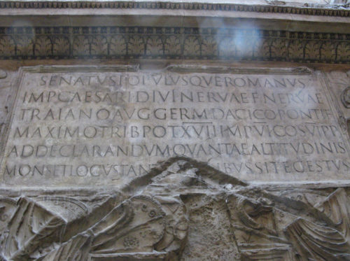
courtesy of Silver Tusk
The image below, taken from Cahier de Lettres, a 1920s manual for sign painters, shows the complex faceting of the Roman capital more closely, revealing its peculiar combination of cuts and shadings, derived from stone cutting, and transferred to lettering for sign painting.
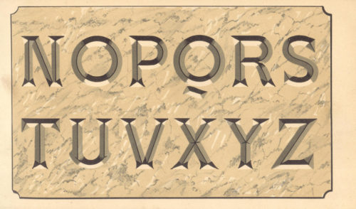
courtesy of patricia m
This kind of letter is the most difficult to imitate (Cahier de Lettres. Planche 23).
A small history of colored fonts
As Thomas L’excellent explains in his mémoire Typographie en couleurs [online or in pdf], Aztecs and Mayans, Phoenicians, Egyptians, and Romans are all known to have made use of red as the contrast color to add significance to particular parts of a text. Red was often used during the Middle Ages where we would now use punctuation and start a new sentence with a capital letter, and in book illustration in particular, the leading capital letter often carried ornamental decorations.
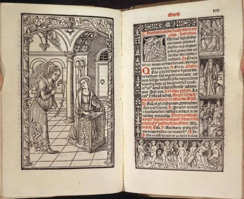
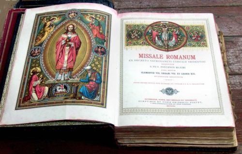
Our examples are double page spreads from the Missale Romanum which is the liturgical book that contains the texts and rubrics for the celebration of the Mass in the Roman Rite of the Catholic Church.
The first image is taken from a 1591 Missale, showing the typical use of red to mark the emphasis to be given to particular blocks of text when read aloud.
According to the Cahier de Lettres, when sign painters created signs for a workshop by painting letters onto a signboard, they were trying to communicate the status and character of the workshop, not just the name. They were often innovative, reproducing lettering styles they had seen before but using their own techniques. Those who had an excellent command of craftsmanship were able to achieve very clever special effects through their old-school skeuomorphism. That was before shops started to use zinc, golden wood or crystal for their signs.
In the late 1920s, Cassandre designed the Bifur for a French foundry, Deberny et Peignot, and started to use multicolored fonts in his posters and ads. At that time, engraving such an alphabet was a tour de force. You can see the Bifur specimen on fontsinuse. From that day, you could print colored fonts as you would have printed any other fonts. And then came computers, and the Postscript font format, and opentype, which was – is still – black only.
While font formats have not yet included a way to inscribe colors in the font itself, designers have solved the problem by proposing a different file for each layer of the font. For example, the AW Conqueror Carved – designed by Typofonderie – uses a different layer for each color.

AW Conqueror, free to use, only for the print

AW Conqueror, free to use when not embedded online.
Web publishers have been developing some ways of doing this kind of layering for the web, and for printing books directly from the browser.
Two approaches for the color fonts
The first approach uses the colorfont.js library, the second uses the Sean McBride experiment.
WARNING POINT
Working with fonts and colors in different browsers has a lot of browser-dependent requirements. First, we must use a font designed for this particular use. Since type is not displayed the same way in every browser, you’ll have to experiment before making any final choices.
Colorfont.js
The colorfont.js tool was commissioned by Dave Crossland and built by the Manufactura Independente. This idea behind it is simple: JavaScript is used to create a copy of the title which is exactly positioned above the title, while another font is declared in the css.
How does it work?
First, let’s create the html file with the content and the call to JavaScript and css files.
The font.css with the @font-face declarations
<link rel="stylesheet" href="css/fonts.css">
The styles.css with the styling of the text and the overlay
<link rel="stylesheet" href="css/styles.css">
Finally the jquery and the colorfont.js libraries
<script src="js/jquery-1.js" charset="utf-8"></script>
<script src="js/colorfont.js" charset="utf-8"></script>
The body
To add the multi-layered effect to anything in the web page, we need to add the colorfont class to our element. For example, we add this class to the h1 below.
<article>
  <h1 class='colorfont'>How is it working?</h1>
</article>
THE CSS
Let’s create the two css declarations we’ll need (creating two files helps to separate the installed font in the first one, and the styles in the second one).
the fonts
@font-face {
  font-family: 'Din OSP';
  font-weight: normal;
  font-style: normal;
  src: url('fonts/DIN_OSP-Original.ttf') format('woff');
}
@font-face {
  font-family: 'Din Overlay';
  font-weight: normal;
  font-style: normal;
  src: url('fonts/DIN_OSP-OverlayOne.ttf') format('woff');
}
For each font, we have to declare the name of the font in font-family, its font-weight and its font-style. The src is the location of the font. Once these have been declared, we can use them as that combined font-family anywhere on our site.
The styling
First, we have to style the .colorfont element, which is displayed as the base color over which the second color element will be displayed
.colorfont {
  font-size: 10em;
  font-family: "Din OSP";
  color: #75D6B3 ;
}
Then, we can style the .colorfont-overlay, changing the font and the color of the second part of the colorfont.
.colorfont-overlay {
  font-family: "Din Overlay";
  color: #eeD6B3;
}
And here is the result: 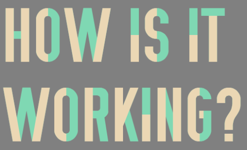
PROS
- Since the second element is a clone of the first one, they’ll react the same way when modified;
- Positioning is done by the library;
- This is easily modifiable;
- Text selection is possible;
- There’s already a couple of free fonts that can be used;
- Manufactura independente are conducting workshops to add fonts to the tools. Here is an example of what it can lead to.
CONS
- The semantics of the page are broken since we have multiple level 1 headers, showing the exact same thing.
- You can only have a two-layered font (even if you can use multiple text shadows to add more depth)
The Sean McBride experiment
Typekit is a tool that provides fonts for website use, for a fee. Bought by Adobe, it became a way to provide fonts for web designers. Typekit offers purchasable licenses for the Hamilton Wood Type Foundry. This foundry digitized the American Stars font, which is made of three layers, and in his Get the look talk, Sean McBride has explained how the layers are achieved.
HTML + JS
We’re using the same HTML file, but we add a small JavaScript before the end of the body tag.
<script>
  $('.colorfont').each(function() {
  $(this).attr('data-content', $(this).text());
});
  </script>
The JavaScript will look for all the .colorfont elements and will add a data-content attribute to the html markup, cloning the content of the tag. Here is the output of this html + JavaScript:
<h1 data-content="How is it working?" class="colorfont title1">How is it working?</h1>
CSS
First, we style the colorfont element.
.colorfont:before,
.colorfont:after {
  content: attr(data-content);
  display: block;
  position: absolute;
  top: 0;
  left: 0;
}
As you see, we only position our :before and :after element in the .colorfont style. The cloning of the content is made within the css and is done twice, which means we can use three different fonts.
.title3 {
  position: relative;
  font-family: "Douar Overlay";
  color: darkred;
  text-transform: uppercase;
}
.title3:before {
  font-family: "Douar Outline";
  color: #FF674D;
}
.title3:after {
  font-family: "Douar";
  color: gold;
}
With a small padding-top and opacity tweaking, we can create some very specific type effects. Here is an example of what can be done with it.

PROS
- We can have more layers in our fonts;
- Everything is done in the css (almost);
CONS
- Selection of the text becomes almost impossible, since we’re using :before and :after elements.
- Fonts should be tried before use;
- The display of layers will not be the same if the window is resized.
- At the time of writing, this works only with Firefox.
The bonus
This will inspire others to expand the possibilities to more browsers and there will for sure be somebody who knows how to make real color fonts, and we can watch it develop.
One last thing: what if we’d used totally different fonts to play the same game?

an example for the road
And for the fellow middle-button-click-crazy-guys around here, here are some links to multi-layered fonts:
-
Free
- Tribbon – free – works well with Safari, less well with other browsers;
- UGO font from Valeria Santarelli – pay with a tweet – works well with Safari, less well with other browsers;
- AW Conqueror Carved – the license only works for print, you can only have a web version with Typekit;
-
Pay what you want
- Sullivan – pay what you want for personal use;
- homestead – pay what you want for personal use;
-
Not free
- Player – not free;
- Detroit – not free;
- Pontiac – not free;
- Core circus – not free;
- Core Magic – not free;
- Core circus rough – not free;