Before the advent of the @font-face feature, typography on web was stuck in two states. Either you were using one of the standards (Arial, Helvetica, Times and the pre-installed font on each system), or you were using pictures with the text you needed. And then came CSS3 and the possibility of telling stories using different forms of letters.
When you’re designing the reading experience, you must be careful. Everyone should be able to read the story. To do so, you must take care of the content first. Let’s get real: the content won’t always be made by an html ninja or a code warrior. We’ll need to modify the content to improve the layout without changing any of the semantics, and that’s where javascript comes in handy.
When talking about type, we’ll be using an excellent library made by the great guys at paravel, called Lettering.js. This will automatically split the text into characters, words or lines, in order to modify the way they appear, without touching any of the html.
Let’s make an example :
<p class="lettering">A who dunnit experience</p>
will be rendered as this part of html, if the splits are made of the three possibilities:
<p aria-label="a who dunnit experience" class="lettering surtitle">
<span aria-label="a who dunnit experience" class="line1" aria-hidden="true">
<span aria-label="A" class="word1" aria-hidden="true">
<span class="char1" aria-hidden="true">a</span></span>
<span aria-label="who" class="word2" aria-hidden="true">
<span class="char1" aria-hidden="true">w</span>
<span class="char2" aria-hidden="true">h</span>
<span class="char3" aria-hidden="true">o</span></span>
<span aria-label="dunnit" class="word3" aria-hidden="true">
<span class="char1" aria-hidden="true">d</span>
<span class="char2" aria-hidden="true">u</span>
<span class="char3" aria-hidden="true">n</span>
<span class="char4" aria-hidden="true">n</span>
<span class="char5" aria-hidden="true">i</span>
<span class="char6" aria-hidden="true">t</span></span>
<span aria-label="experience" class="word4" aria-hidden="true">
<span class="char1" aria-hidden="true">e</span>
<span class="char2" aria-hidden="true">x</span>
<span class="char3" aria-hidden="true">p</span>
<span class="char4" aria-hidden="true">e</span>
<span class="char5" aria-hidden="true">r</span>
<span class="char6" aria-hidden="true">i</span>
<span class="char7" aria-hidden="true">e</span>
<span class="char8" aria-hidden="true">n</span>
<span class="char9" aria-hidden="true">c</span>
<span class="char10" aria-hidden="true">e</span></span> </span></p>
from now on, changing the color of one or many letters become really simple. For example, we’d like to have the o in a who dunnit experience red, we only need to add the following css using descendant selector (the third character of the second word of the .lettering class)
.lettering .word2 .char3 {
    color:red;
}
About aria-hidden & aria-label: when modifying content, you need to be sure that the text will stay readable wherever it may be read and by whomever tries to read it. Aria-label is the interface between your html page and the assistive technology that will translate your content to someone who cannot see or read the content as you designed it. In the previous example, only the aria-label for the p will be translated, since the aria-hidden is not set to false. You can read more informations about the aria at the W3 website
Lettering in action
Superfast jellyfish

It’s all under water, ain’t it?
The html we’ll use to create this picture is the following:
- the paragraph (pay attention to how we added some <br> tag to the content to let lettering.js split the text into lines)
<p class="lettering">Superfast Superfast, I come in last, <br>but just in time for breakfast.<br> Keep it through, Keep it through, forever blue.<br> Tonight's the night for action.<br> Aluminum I crush your f u n aluminum.<br> The sea is radioactive.<br> The sea is radioactive.</p>
- the title
<h1 class="lettering">super fast jellyfish</h1>
- the javascript
// the line below can be translated as "start the script when all the html of the page is loaded"
$(document).ready(function() {
    // the line below wil start lettering.js for all the element with a *lettering* class, and split the content in lines, words and character.
    $(".lettering").lettering('lines').children('span').lettering('words').children('span').lettering();
});
Some insights on the css
the [class*=“line”] pseudo element
To add style to every lines, we could use a .line1, .line2, .line3 and so on. It would bring something like that for the two lines:
  p .line1 {
      display: block;
      text-transform: uppercase;
      transform: perspective(300px) rotateY(20deg);
  }
  p .line2 {
      display: block;
      text-transform: uppercase;
      transform: perspective(760px) rotateY(-20deg);
  }
And we would have it add the same for each line of the content. After three or four lines, it can be done without too much strugggle, but what if we’d like to embellish a longer text? Here comes the savior, the one we call the attribute selector. The attribute selector can be used to style html with some attribute. For example :
<p data='20000'>test</p>
will be styled with the following css:
[data=='20000'] {color: blue;}
or by the following:
[data*='20000'] {color: blue;}
from the W3C specs for css3, we can tell this:
| Attribute selector | Element | Exemple |
|---|---|---|
| [attribute] | Will style any element with the attribute |
<p attribute=“smth”>bla bla</p> |
| [attribute=val] | Will style any element with the value of the attribute being exactly “val”. |
<p attribute=“val”>bla bla</p> |
| [attribute~=val] | Will style an element containing the value of the attribute “val” alone or among others. |
<p attribute=“val smth”>bla bla</p> |
| [attribute|=val] | Will style any element with the value of the attribute being “val-” followed by anything – you must use a - (U+002D) character. |
<p attribute=“val–2000”>bla bla</p> |
| [attribute^=val] | Will style any element with the attribute value starts with “val”. |
<p attribute=“valsmth”>bla bla</p> |
| [attribute$=val] | Will style any element with the attribute value ends with “val”. |
<p attribute=“smthval”>bla bla</p> |
| [attribute*=val] | Will style any element with the attribute value contents “val”. |
<p attribute=“areyouvalok”>bla bla</p> |
Let’s try this on our jellyfish background:
First, we need all of our lines of text to be uppercase. To have a easier control on their style, we want those letters be displayed as a block. This way, each line will be placed below the previous one.
p [class*="line"] {
  display: block;
  text-transform: uppercase;
}
Then, we use the nth-of-type element with even and odd suffix to add a different transformation to the text.
p [class*="line"]:nth-of-type(even) {
  transform: perspective(300px) rotateY(20deg);
}
p [class*="line"]:nth-of-type(odd) {
  transform: perspective(760px) rotateY(-20deg);
}
And this is how it’s done. you use 216 character in your html to design the content of all the paragraphs that follow.
And here is the result.
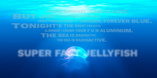
One last thing, to make the underwater cloud effect for the title, we used the following css. While the text has no color – or has the transparent color, to be more exact – we use a blurry text shadow css.
h1 [class*="word"] {
  /*text-shadow: horizontal-offset vertial-offset blur color-of-the-shadow;*/
  text-shadow: 7px  7px 14px hsla(200, 24%, 100%, 0.5);
  color: transparent;
}
Have fun with the files.

NB: The picture used in this article was made by Danist07 for Unsplash and you can do whatever you want with it.