If we can make books in browsers, we can also make covers in the browser, right?
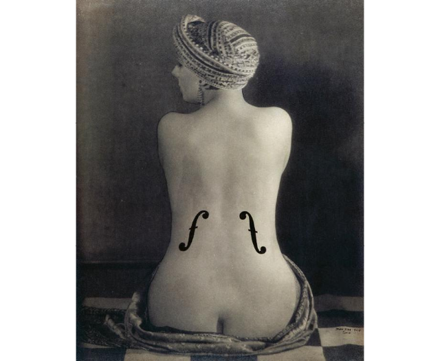
When Man Ray made one of his most famous images - Le Violon d’Ingres - he did so by using a double exposure in the darkroom with a technique known as a Rayograph. To do this he placed a paper layer with an f-hole shape cut into it over the original image and exposed the paper again to light from the enlarger. At the time the use of layers like this was highly experimental but today they are the basis of modern graphic design.
So, if we want to make a cover in a browser, we need to think about what layers we require. I’m going to define those in HTML:
<div class="page">
  <div class="spread">
    <div class="background"></div>
    <div class="backcover"></div>
    <div class="frontcover"></div>
    <div class="spinecover"></div>
  </div>
</div>
The page and the paper
As we saw previously, to export a PDF with as much control as possible we need to define the size of the sheet of paper we’ll be printing on. Depending on the printer you’re working with, you may also need to specify crop marks.
First let’s define a sheet of paper of 300 x 300 mm in CSS.
/* for the print
--------------------*/
@page {
  size: 30cm 30cm;
}
/* for the screen
--------------------*/
body {
  /* a few lines to be sure that the cover stays in the middle of the screen */
  display: flex;
  justify-content: center;
  align-items: center;
}
.page {
  /* size of the sheet of paper  */
  width: 30cm;
  height: 30cm;
  /* to center vertically and horizontally
  display: flex;
}
The cover spread with crop marks
Our next layer is the cover spread, this will be the box that contains the font cover, spine and back cover. Let’s use the CSS-grid specs:
.spread {
/* The size of the columns that will contain back, spine and front. There is no row in this element */
  display: grid;
  grid-template-columns: 125mm 5mm 125mm;
/* We’re giving nick name to each column to send content directly where it should be. */
  grid-template-areas: "back spine front";
  }
/* Those three lines will put the content of each element where it should be on the cover. */
.frontcover {grid-area: front}
.spine {grid-area: spine}
.backcover {grid-area: back}
The cover spread layer will also contain crop marks.
By using :before and :after CSS pseudo elements with a black thin border, and a white border on the cover spread layer, you end up with perfect crop marks.
Kudos to Rico Sta. Cruz for his clever implementation of crop marks.
.spread {
  /* height and width for the spread */
  width: 255mm;
  height: 210mm;
  // border for the crop mark polyfill
  border: 8px solid white;
  &:before,
  &:after {
    position: absolute;
    content: '';
    border: solid black;
    z-index: -1;
  }
  &:before {
    top: -32px;
    bottom: -32px;
    left: 16px;
    right: 16px;
    border-width: 0 1px;
  }
  &:after {
    left: -32px;
    right: -32px;
    top: 16px;
    bottom: 16px;
    border-width: 1px 0;
  }
}
Editable text and color
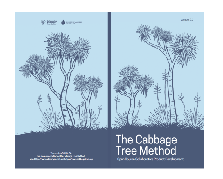
In the example book we are using here - the Cabbage Tree Method - we wish to publish editions (versions) with the same design but each using different colors. We also wish the team to be able to edit the text of the book and correct it if necessary. No need for the designer to do this, distribute the work to the right people in the team!
We can do this by adding the content as we did in the @page tutorial, using absolute positioning and content editable. This will enable anyone in the team to change the text of the cover, correcting a typo or adding a missing author name etc. Collaborative cover production! Something that is not easy to achieve in desktop design applications like InDesign.
Since the appearance of CSS variables, it has been easy to change the colors of a wide range of elements. We do this by defining the color of the element as a variable. For example, our cover uses 3 colors:
/* Defining the colors for the whole page/book
--------------------------------*/
:root {
  --color-back: #c4e3f3;
  --color-front: #495776;
  --color-text: #ffffff;
}
/* Using the variable-colors
-------------------------------- */
.backcover {
  background: var(--color-back);
}
.text {
  color: var(--color-text);
}
It now becomes easy to add a small JavaScript color picker to change the colors on the fly. Let’s do that!
The html
This is the HTML you will need to enable a JavaScript color picker.
 <div class="buttons">
  <h2>choose your own colors</h2>
  <input id="text" type="color" name="color-text" value="#ffffff"/>
  <input id="back" type="color" name="color-back" value="#c4e3f3"/>
  <input id="front" type="color" name="color-front" value="#495776"/>
</div>
The javascript
This is the JavaScript.
  const inputs = document.querySelectorAll('.buttons input');
  function handleUpdate() {
    document.documentElement.style.setProperty(`--${this.name}`, this.value);
  }
  inputs.forEach(input => input.addEventListener('change', handleUpdate));
  inputs.forEach(input => input.addEventListener('mousemove', handleUpdate));
Masking
But wait, how do you change color of a picture or a logo? Depending on the format of the image you are using there are two ways to do this:
- SVG - vector illustrations should be inline SVG, and not a link to a SVG in an img tag. This way, it becomes easy to change colors in the CSS using the fill property.
- PNG - if the image is a raster image we use a mask - a black and transparent PNG silhouette, with a line of CSS to change the color.
We’ll discuss SVG further soon at the Paged Media website. But for now, let’s take a look at masking a PNG.
I’ve used an alpha mask which is a mask that we apply to a transparent cover spread image. Therefore, you need to make sure that your cover spread PNG is made of only black and transparent regions.

Then, everything else is done in the CSS:
.background {
    /* color that will be applied to the mask */
    background: var(--color-front);
    /* image that will be the mask */
    -webkit-mask: url("../img/lol.png");
    mask: url("../img/lol.png");
    /* size of the mask*/
    -webkit-mask-size: 110%;
    mask-size: 110%;
    /* position of the mask */
    -webkit-mask-position: -0mm -10mm;
    mask-position: -0mm -10mm;
}
With four lines of code, you’re able to change the color of the black illustration.
You can try a demo here which shows this example with editable text and a color picker for changes the color of the background image and text. Try then printing to PDF from the browser. It’s a kind of magic!
The files (including all code) used for this cover are available from Cokos gitlab with the complete book and the new HTML cover. Feel free to download, clean (there is always some cleaning to do!), play with it, and even send merge requests.