Unfolding the @page
As a designer, I often have to deal with clients who need to make corrections to pdf, to websites, to whatever they have asked me to design, because they are not able to do it themselves. Naturally enough, they don’t have the specialised tools used by graphic designers, which are neither cheap nor easy to use; and also, designers seldom use ordinary office tools like Microsoft Word when they need to typeset some content.
Most often, there are two scenarios. A designer provides a layout for a Word file that the client then uses to create and publish content. If everything goes well — let’s be honest, this happens on a regular basis — the output is not that bad: the layout is still there as it was designed, the type font has not changed, the styles are used, and the exported pdf is good enough to be printed in the office or shared on the web. On the other hand, when anything goes wrong, the client calls the designer and, often, the designer is given the file, makes the corrections, cleans the layout, and charges the client. Nobody likes to charge a client for this, firstly because you can’t charge him the real amount of time you spent on it, and secondly because you are repeating a job you already did before. But as they say, it’s part of the service.
Well, thanks to CaSSius, that is how it used to be.
CaSSius is an impressive tool. it can do a lot of things, and it works in every browser[1]. As Martin (the developer) explains, CaSSius lets you produce a pdf document from html content using some nice css and JavaScript. But before we dive completely into the creation of specific layouts for CaSSius, we need to understand how a browser can transform any html document into a specific sized PDF.
Understanding how the @page works.
Let’s say you need to make a poster and you need to give to the client the possibility to change a few things on this poster, like the date, or even the title. HTML can be the right way to go: it works in all browsers, it does not need any particular applications to be installed, fonts and colours are already set up by a professional designer, and the pdf will be ready for print without any problems.
To do so, you still have to struggle with the size of elements on screen and the size of elements on the paper.
I’m pretty sure that you will have tried to print a page and ended up with a huge sidebar and a small part of the content you wanted to read. That’s because HTML has sized content, and the size of the content mustn’t outrun the size of the paper.
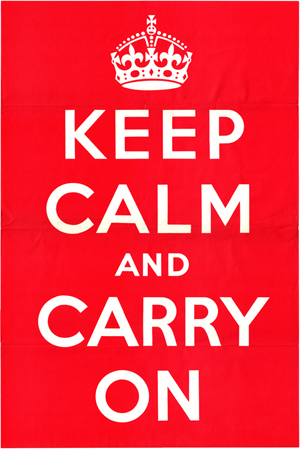
To avoid this, we can now use the @page CSS at-rule. To explain this, we’re going to make a poster. Let’s build one of the most iconic ones (since the 2000s) with quite a history:
Keep Calm and Carry On was a motivational poster produced by the British government in 1939 in preparation for the Second World War. The poster was intended to raise the morale of the British public, threatened with widely predicted mass air attacks on major cities. Although 2.45 million copies were printed, and although the Blitz did in fact take place, the poster was hardly ever publicly displayed and was little known until a copy was rediscovered at Barter Books, a bookshop in Alnwick. It has since been re-issued by a number of private companies, and has been used as the decorative theme for a range of products. (from Wikipedia)
For the purposes of this exercise, the crown icon comes from Wikipedia and the typeface, a revival of Gill’s work, comes from the finest guys of Open Source publishing, Gill sans alternative from OSP.
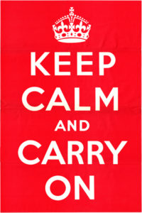
Let’s build the poster from scratch.
The html
We are using inline svg for the crown, since it’s the best way to modify it directly using css. The only class used here is for the AND word which is a little smaller than the other word.
<body>
  <article class="page">
    <svg viewBox="0 0 91 79" version="1.1" xmlns="https://www.w3.org/2000/svg" xmlns:xlink="https://www.w3.org/1999/xlink">
      <title>crown</title>
      <g id="crown">
        <path d="M83.593,33.2119991 <!-- here are the location of all the point and vector needed to produce the svg.  --> L10.269,64.0979991 Z"></path>
      </g>
    </svg>
    <p contenteditable="true">keep</p>
    <p contenteditable="true">calm</p>
    <p class="and" contenteditable="true">and</p>
    <p contenteditable="true">design</p>
    <p contenteditable="true">stuff</p>
  </article>
</body>
The interesting thing here is the appearance of the .page class added to the body. To tell the computer that this page is the one we want to print, we need to add some css for it.
The CSS
I won’t talk about the css for the styling, it’s pretty easy and everything is in the file you’ll be able to download below. Let’s focus on the print.
First, we need to style how the box appears on the screen:
.page {
  /* width of the page */
  width: 320 mm;
  /* height of the page */
  height: 450 mm;
  /* shadow to see the page in the browser if the background is transparent*/
  box - shadow: 0 0 0.5 rem rgba(0, 0, 0, 0.25);
  /* to position the children absolutely, we need to specify the relative position of the page */
  position: relative;
  overflow: hidden;
  margin: 2e m auto;
}
Those styles will be shared with the printed version of the css. We need to override some styles to be sure that the layout is as expected.
/* the @media print to specify this only affect the content when printed*/
@media print {
  .page {
    /* we remove margin and padding*/
    margin: 0;
    padding: 0;
    /* we position the .page body on the top left angle of the page*/
    position: absolute;
    left: 0;
    top: 0;
  }
}
If you try to print with those lines, Chrome will ask you the size of the paper, and the margins, and if you want to see the top header and so on. To avoid this behavior and take the full power from Chrome’s print utility, we need to provide those lines in the css:
@page {
  size: 320mm 450mm;
  margin: 0;
}
In future, the @page will be able to handle a lot of what we use when printing books: running heads, page number counter, different margins depending on odd/even page numbering. However, we are currently waiting for the browsers to be fully operational to produce what we need.
Using this css, we can produce html posters, ready for print. Everything being vectors, we could even produce a huge pdf in order to cover a building for example (since Chrome can’t unzoom below 25%, good luck with that, but in theory, it would do the job). Using only em for the size of the text, and a font-size: 100% for the body, you only need to change the size of the .page class to produce the largest PDF. (InDesign cannot handle a surface with more than 5486.4mm²: it looks like the Make it bigger effect just took a huge step up ).
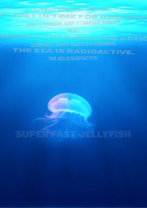
For another example, you might also want to refer to the poster we made with the jellyfish illustration last year.
Until next time!
Download the example files for the jellyfish poster here and for the keep calm and carry on poster here.
- CSS-regions used to be a way to create book design in html + css, but it seems that very few browsers will be using that element again. Google Chrome left Webkit for Blink some years ago, abandoning CSS-regions at the same time. Safari is one of the only which still shows some love for CSS-regions. ↩